Marketing- Form Builder tab
The Form Builder tab within the Marketing layer is where the lender stores, edits or creates all of their online customer forms.
Last updated: 04 September 2026
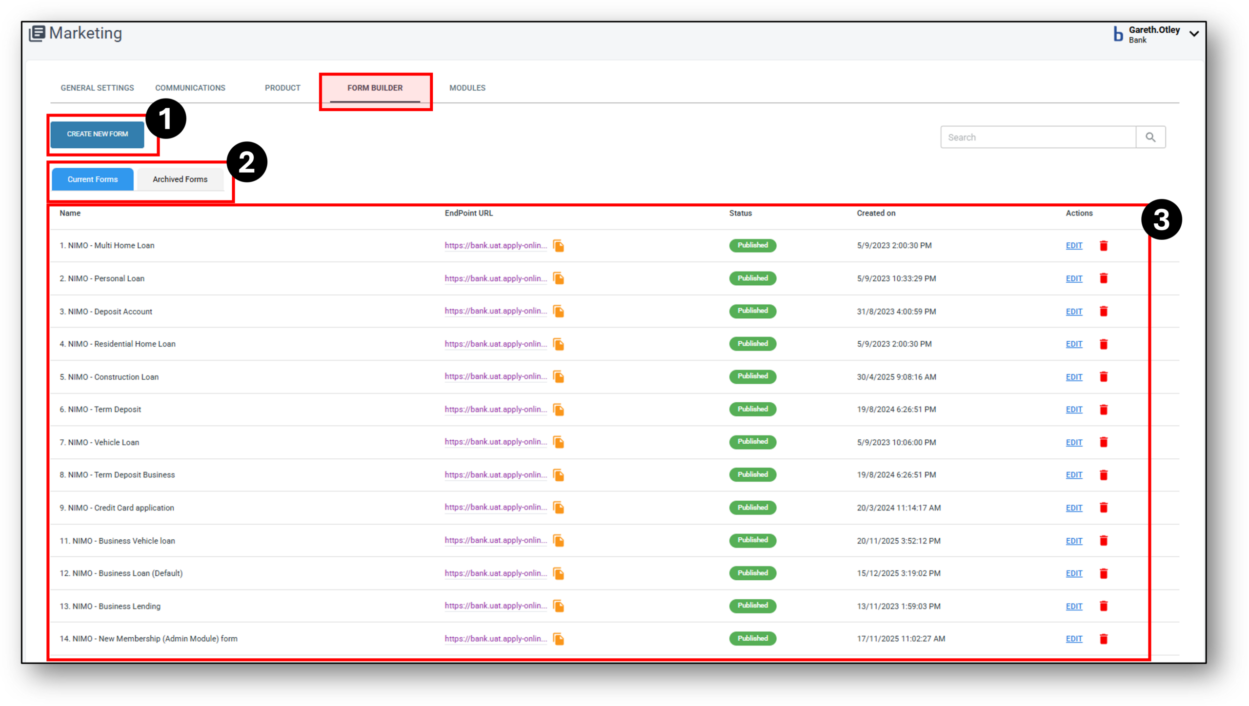

1. Create New Form
Forms Overview:
The Form builder allows you to create your customer application form.
The application form is built from adding available modules that can be arranged according to the required workflow of the application.
Each module within the form represents a page / step that the customer needs to complete in the application.

Module Overview:
In every module, there exist customisable questions and elements that can be tailored to meet your organisations specific requirements. This feature enables you to create the questions you want to use in your application as well as select which options you wish to be visible for the customer, how you frame the questions and determine which elements are mandatory for customers to respond to before proceeding to the subsequent page.
Getting Started:
STEP 1 – Click on the “Create New Form” button.
STEP 2 – A pop-up will appear, asking you to name your new form*
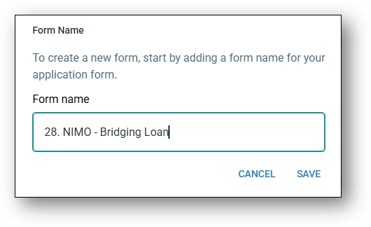
TIP: When naming your forms, try to stick to a naming convention that will help you order the forms. If you are setting up multiple forms of the same type, using a consistent naming convention can make the forms list appear less clunky and much easier to locate. Try using attributes that help you order the forms.
For example – if you have five different home loan forms, rather than starting with a product name for the form, it’s best practice to start with the product name “Home Loan” as a prefix of the form name. See below:
Jumbled order:
-
- “Governement Scheme 5% Deposit Home Loan“ would be ordered under ‘G’, similarly
- “Variable Rate Home Loan“ would be listed under ‘V’.
Clean order:
Renaming both these to the following means they will both be listed under the letter ‘H’;
-
- “Home Loan – Governemnet Scheme 5% Deposit“, and
- “Home Loan – Variable Rate“
Alternative order:
You can also use a number system to help you order your forms. Alphabetically speaking, numbers will be listed before letters. For Example:
-
- “10 – Governement Scheme 5% Deposit Home Loan”
- “21 – Secured Personal Loan”
- “20 – Unsecured Personal Loan”
- “12 – Fixed Rate Home Loan”
- “11 – Variable Rate Home Loan”
STEP 3 – After saving the form name, a new screen will appear for configuring the form.
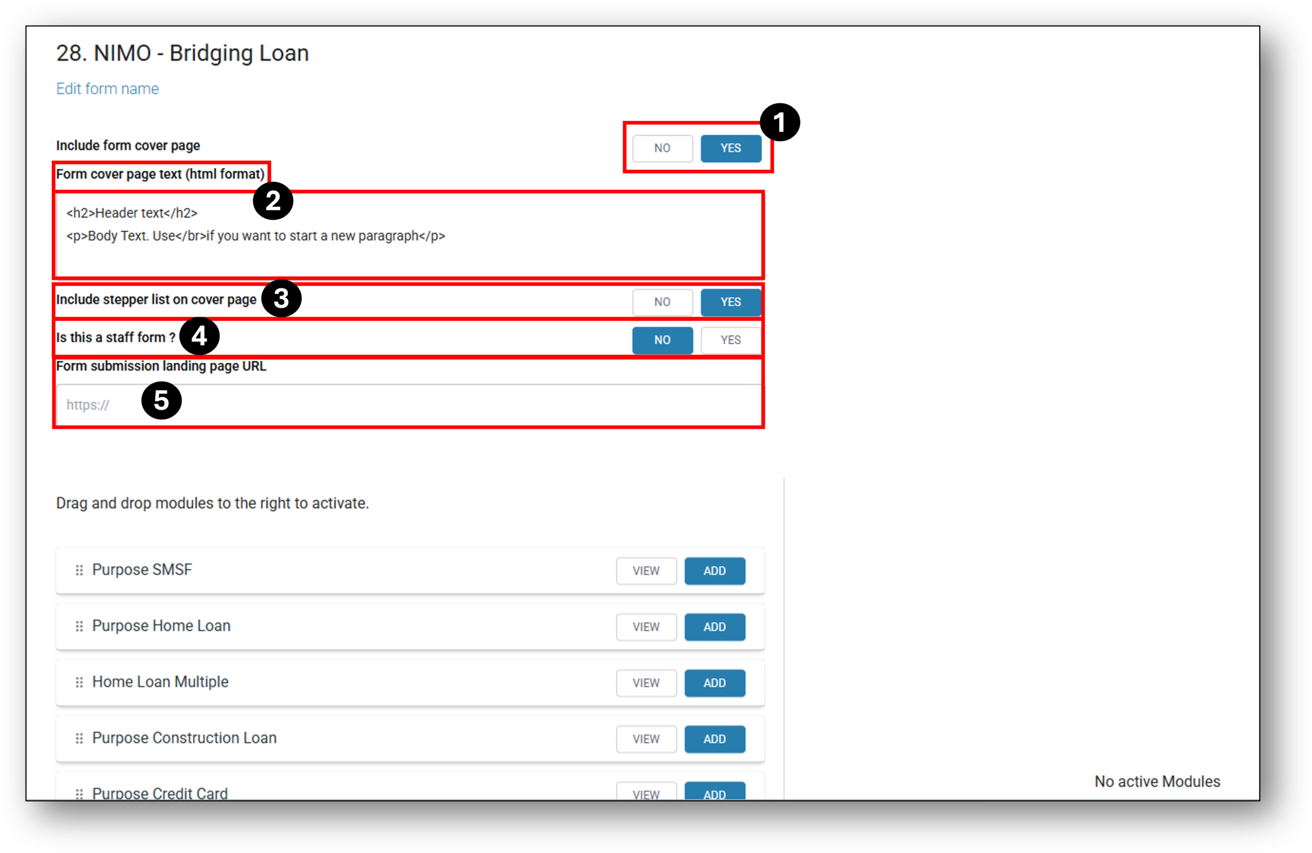
To proceed, you can customise the following parts of your form:
1. Include form cover page: Yes or No (Cover pages are customisable as see in the next section)
2. Form cover page text(html format): This section can be tailored to your organisations’ branding using HTML. It’s best to customise this section with the help from your marketing or brand team with respect to aligning your organisations colour, image, layout and voice brand guidelines. To make it an efficient process, rather than writing out out all the HTML code (or learning how to code in HTML for that matter), use a ‘Word-to-HTML’ editor. See the Marketing Tip sheet on the Main page under the “Help Guides” tile to see how easy this process can be.
3. Include stepper list on cover page: Additionally, you have the option to include a “stepper” that indicates how many sections are required for completion. You can even tailor the stepper by changing the HTML code at the top of each module. Visit the drop down below “HTML Code Ideas” to see an example of a different stepper.
4. Is this a staff form?: Yes or No (relates directly to the ‘TEAMS’ functionality within Nimo. More details on the ‘TEAMS’ function can be found in the Administration layer > Manage Users tab > Teams tab.)
5. Form submission landing page URL: This is the page that a customer will be redirected to when they complete the application form. It could be your organisations main homepage or it could be a specific “Thank you” webpage setup where you choose to thank your customer for filling out the application forms and advising them of the next steps (not this can also be achieved through the automated customer communications).
The next step in the Form Builder process is to ‘Add’ the modules to the right-hand side to build out the customer application experience the way you want.
Here is an example of the suggested sequence order of modules for a seamless application flow.

2. Current & Archived forms
Current – Displays all the forms that are either currently published or unpublished (unpublished is the state of a form when changes are being made).
Archive – Displys all the forms that have been removed from the current list and archived. It won’t display any forms that are deleted. Once a form is ‘Archived’, a user won’t be able to access the form. They can either choose to further delete the form for good, alternatively the form can be restored.
NOTE: An audit log captures the movement of forms in and out of archiving.
IMPORTANT: Deleting forms is not a recommended option in case there are any existing in flight applications that have currently been generated from that form. If this happens please contact Nimo directly to see if we can help you recover the form.
3. Forms

Name: This is the name of the customer form and should reflect what it relates to on the lenders website.
E.g: Personal Loan would be the name of the form you would use that links to the ‘Apply Now’ button under your organisations Personal Loan webpages.
Endpoint URL: This is the specific whitelisted ‘Address / URL’ (Uniform Resource Locator) that is linked to the relevant ‘Apply Now’ button on your organisations website. To access the form at any stage, you can click this URL to see what the for looks like and test if it works.
Status: This column shows whether form is published (Live) or Available (Not Live). NOTE: If you have brokers accessing your forms, they will not see a form if it is left in an ‘Available’ status.
Created On: This is the original date & time stamp the form was created. It will not change even if the form is modified.
Action: To modify the form, simply click on the ‘Edit’ action to open up the form. As soon as you press ‘Save in the form, it will change the status on this screen from ‘Published’ to ‘Available’. You will need to click ‘Available’ to republish the form again.
Delete: Use the rubbish bin if you need to delete the form. But please not this is not the recommended practice because it is a permanent deletion. It will also affect all current In-Flight applications that are currently using this form. Instead, the preferred option is archiving old forms. For further information on archiving see the above section ‘Current & Archived forms’.
Edit Form Details
Bespoke shortcodes that can create key uplifts to your forms
Key Attributes of the code:
Font characteristics that can be changed include:
-
- ‘font-size’ – e.g. 16px or 30px (Can be controlled at an individual word level)
- ‘font-colour’ – e.g. #304762-Navy Blue or #ffffff-White (Can be controlled at an individual word level)
- ‘font-weight’ – e.g. 1000 is very bold or 100 is a normal thickness (Can be controlled at an individual word level)
- ‘font-family’ – e.g. Arial,Helvetica,sans-serif
Other characteristics that can be changed include:
-
- ‘padding’ – e.g. 18px (top) 18px (right) 26px (bottom) 18px(left); refers to the space between the edge of the background and the next piece of content (words, image, shape etc.)
- ‘background’ – e.g. #304762-Navy Blue or #ffffff-White (Can be controlled at an individual word level).

Below is a list of different solutions and their related codes to get you started:
Different Stepper:

Code Embed:
<div style=”background: #07192f; padding: 18px 18px 26px 18px; font-family: Arial,Helvetica,sans-serif; color: #fff; width: 100%; box-sizing: border-box; border-radius: 12px;”>
<div style=”display: flex; justify-content: space-between; align-items: center; margin-bottom: 10px;”>
<div style=”font-size: 30px; font-weight: 600;”>Get Started</div>
<div style=”font-size: 16px; color: #b8c7d9;”>Step 1 of 8</div>
</div>
<div style=”height: 4px; background: #304762; border-radius: 20px; overflow: hidden; width: 100%;”> </div>
</div>
CODE EMBED:
CODE EMBED:
CODE EMBED:
CODE EMBED:
Available Modules to select from
| Row & Line No. | Question Function & Editable Name | Options to choose from |
| 1.1 | ProductSelection | Select the Home Loan products that you want to be discoverable in this Application form only. |
| 1.2 | Products | |
| 2.1 | buttons | Select from Refiance or |
| 2.2 | what are you looking for a loan | |
| 3.1 | ||
| 3.2 | ||
| 4.1 | ||
| 4.2 | ||
| 5.1 | ||
| 5.2 | ||
Active Modules
Bespoke shortcodes that can create key uplifts to your forms
Key Attributes of the code:
Font characteristics that can be changed include:
-
- ‘font-size’ – e.g. 16px or 30px (Can be controlled at an individual word level)
- ‘font-colour’ – e.g. #304762-Navy Blue or #ffffff-White (Can be controlled at an individual word level)
- ‘font-weight’ – e.g. 1000 is very bold or 100 is a normal thickness (Can be controlled at an individual word level)
- ‘font-family’ – e.g. Arial,Helvetica,sans-serif
Other characteristics that can be changed include:
-
- ‘padding’ – e.g. 18px (top) 18px (right) 26px (bottom) 18px(left); refers to the space between the edge of the background and the next piece of content (words, image, shape etc.)
- ‘background’ – e.g. #304762-Navy Blue or #ffffff-White (Can be controlled at an individual word level).
Below is a list of different solutions and their related codes to get you started:
Different Stepper:
Code Embed:
<div style=”background: #07192f; padding: 18px 18px 26px 18px; font-family: Arial,Helvetica,sans-serif; color: #fff; width: 100%; box-sizing: border-box; border-radius: 12px;”>
<div style=”display: flex; justify-content: space-between; align-items: center; margin-bottom: 10px;”>
<div style=”font-size: 30px; font-weight: 600;”>Get Started</div>
<div style=”font-size: 16px; color: #b8c7d9;”>Step 1 of 8</div>
</div>
<div style=”height: 4px; background: #304762; border-radius: 20px; overflow: hidden; width: 100%;”> </div>
</div>
CODE EMBED:
CODE EMBED:
CODE EMBED:
CODE EMBED:
HTML Code Ideas
Bespoke shortcodes that can create key uplifts to your forms
Key Attributes of the code:
Font characteristics that can be changed include:
-
- ‘font-size’ – e.g. 16px or 30px (Can be controlled at an individual word level)
- ‘font-colour’ – e.g. #304762-Navy Blue or #ffffff-White (Can be controlled at an individual word level)
- ‘font-weight’ – e.g. 1000 is very bold or 100 is a normal thickness (Can be controlled at an individual word level)
- ‘font-family’ – e.g. Arial,Helvetica,sans-serif
Other characteristics that can be changed include:
-
- ‘padding’ – e.g. 18px (top) 18px (right) 26px (bottom) 18px(left); refers to the space between the edge of the background and the next piece of content (words, image, shape etc.)
- ‘background’ – e.g. #304762-Navy Blue or #ffffff-White (Can be controlled at an individual word level).
Below is a list of different solutions and their related codes to get you started:
Different Stepper:
Code Embed:
<div style=”background: #07192f; padding: 18px 18px 26px 18px; font-family: Arial,Helvetica,sans-serif; color: #fff; width: 100%; box-sizing: border-box; border-radius: 12px;”>
<div style=”display: flex; justify-content: space-between; align-items: center; margin-bottom: 10px;”>
<div style=”font-size: 30px; font-weight: 600;”>Get Started</div>
<div style=”font-size: 16px; color: #b8c7d9;”>Step 1 of 8</div>
</div>
<div style=”height: 4px; background: #304762; border-radius: 20px; overflow: hidden; width: 100%;”> </div>
</div>
CODE EMBED:
CODE EMBED:
CODE EMBED:
CODE EMBED: